Norman principles
Delineate the elements of interaction design. Demonstrated below are good examples of each of those elements.- Affordances and signifiers. In other words, functions and perceivable indicators of that function.
 |
| Ex: A doorknob signifies the affordance of pushing. |
- Mapping. When controls are mapped in a way to enable function.
 |
| Ex: A piano app's buttons are mapped naturally to an actual piano. [Flickr] |
- Feedback. A confirmation that the function is successfully (or not) executed.
 |
| Ex: Bell doorbell makes audible sound when rung. [Wikimedia Commons] |
- Constraints. Prevents user from engaging in improper function.
 |
| Ex: A yellow line at a stop sign (usually) prevents drivers from crossing without stopping. [Wikimedia Commons] |
- Visibility. When affordances are easily discoverable.
 |
| Ex: "On" light-indicator shows the boiler is on. [Wikimedia Commons] |
- Models. When an end-user's mental representation of how something works matches with the way the system/product actually works. Varies from person-to-person.
Gestalt principles
Are rules on how to organize content according to conventional human perception. The list includes key ideas about how our brain tends to visually simplify the complex.- Proximity. Objects that are close to one another tend to be mentally grouped together.
⚫⚫⚫⚫⚫
- Similarity. Objects that are similar to one another in size, shape, and/or color are grouped together.
⚫⚫⚫⚪⚪⚪🔴🔴🔴
- Closure. The mind completes familiar objects and patterns when elements are missing.
╭ ╮
╰ ╯
- Continuity. The mind continues patterns and lines, even in case of interruption.
▬🛫▬✈️▬🛬▬▬▬
- Symmetry. We parse complex scenes in a way to reduce complexity.
◢◣ ⋘⋙ 【】⦅ ⦆
- Figure/ground. Our mind separates a scene into figure (foreground) and ground (background).
███████████████████████████
███████▀▀▀░░░░░░░▀▀▀███████
████▀░░░░░░░░░░░░░░░░░▀████
███│░░░░░░░░░░░░░░░░░░░│███
██▌│░░░░░░░░░░░░░░░░░░░│▐██
██░└┐░░░░░░░░░░░░░░░░░┌┘░██
██░░└┐░░░░░░░░░░░░░░░┌┘░░██
██░░┌┘▄▄▄▄▄░░░░░▄▄▄▄▄└┐░░██
██▌░│██████▌░░░▐██████│░▐██
███░│▐███▀▀░░▄░░▀▀███▌│░███
██▀─┘░░░░░░░▐█▌░░░░░░░└─▀██
██▄░░░▄▄▄▓░░▀█▀░░▓▄▄▄░░░▄██
████▄─┘██▌░░░░░░░▐██└─▄████
█████░░▐█─┬┬┬┬┬┬┬─█▌░░█████
████▌░░░▀┬┼┼┼┼┼┼┼┬▀░░░▐████
█████▄░░░└┴┴┴┴┴┴┴┘░░░▄█████
███████▄░░░░░░░░░░░▄███████
██████████▄▄▄▄▄▄▄██████████
███████████████████████████
- Common fate. Elements with the same movement (speed and/or direction) are seen as a single unit.
🏃🏿♀️🏃🏼♂️🏃♀️🏃🏾♂️💨
Jakob Nielsen's Usability Heuristics
These broad rules of interaction design help make a great and user-friendly product.
- Visibility of system status. Keep users informed about system state.
 |
| Autodesk Maya has a neat message bar at the bottom showing the results of every action. |
- Match between system and the real world. Speak the user's language and speak in a natural, logical way.
 |
| "Deal enough damage and you win!" Blizzard's Hearthstone. |
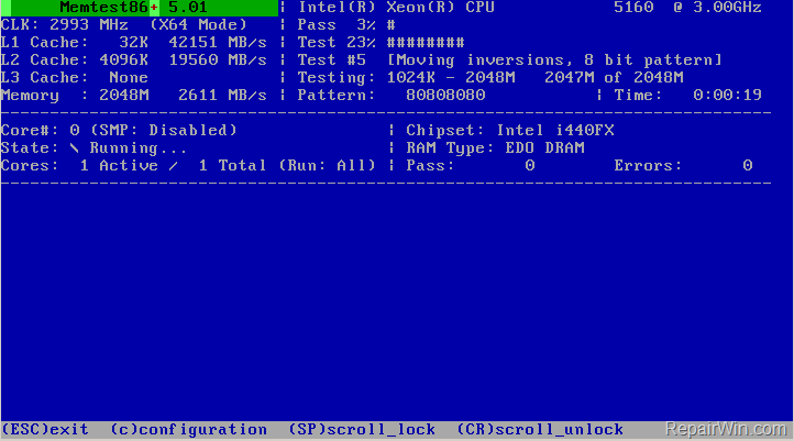
- User control and freedom. Users need to be able to exit, undo, redo.
 |
| "(ESC)exit" command is persistently in view for the user. |
- Consistency and standards. Users shouldn't be confused by similar words (keep use of vocabulary consistent) and have to think whether or not they mean the same thing.
🛒
Shopping
░▓▓░░░▓▓░░▓▓▓░░▓▓▓
▓░░▓░▓░░▓░▓░░▓░░▓░
▓░░░░▓▓▓▓░▓▓▓░░░▓░
▓░░▓░▓░░▓░▓░▓░░░▓░
░▓▓░░▓░░▓░▓░░▓░░▓░
OR
🛒
Shopping
▓▓▓░░░▓▓░░▓▓▓▓
▓░░▓░▓░░▓░▓░░░
▓▓▓░░▓▓▓▓░▓░▓▓
▓░░▓░▓░░▓░▓░░▓
▓▓▓░░▓░░▓░▓▓▓▓
?
- Error prevention. Users should prevent errors and give users confirmation messages.
 |
| "Are you sure you want to move this file to the Recycle Bin?" Windows PC. |
- Recognition rather than recall. Minimize users' memory load by making objects, actions, and options visible.
 |
| All of CellPaint's commands are on the interface. |
- Flexibility and efficiency of use. Offer tutorials for beginners and accelerated options for expert users.
 |
| LyricsTraining app to learn languages through music. |
- Aesthetic and minimalist design. Extraneous info competes with relevant units of info and diminishes their relative visibility.
 |
| Neopets has really gone downhill since being sold to Viacom. |
- Help users recognize, diagnose, and recover from errors. Use plain language to offer a solution.
 |
| "Program removal failure. You must restart Windows to completely remove the program." error message well done. |
- Help and documentation. For complex software, it might be necessary to provide documentation that is easy to search, lists concrete steps, and isn't too large.
 |
| Canva has a very helpful Help button at the bottom-right of the screen. |
There you have it! A very simplified overview of design concepts to get you started thinking about your next project.
No comments:
Post a Comment