Thursday, February 21, 2019

Basic interaction design principles

I'm wrapping up my first course on human-computer interaction, and I've learned three sets of fundamental interaction design concepts. Essentially, this is common sense, formalized. But still a very useful body of concepts to know and that can be applied beyond interaction design.

Norman principles 

Delineate the elements of interaction design. Demonstrated below are good examples of each of those elements.

  • Affordances and signifiers. In other words, functions and perceivable indicators of that function.
Image result for doorknob
Ex: A doorknob signifies the affordance of pushing.

  • Mapping. When controls are mapped in a way to enable function.
Image result for piano app
Ex: A piano app's buttons are mapped naturally to an actual piano. [Flickr]

  • Feedback. A confirmation that the function is successfully (or not) executed. 
Image result for bell doorbell
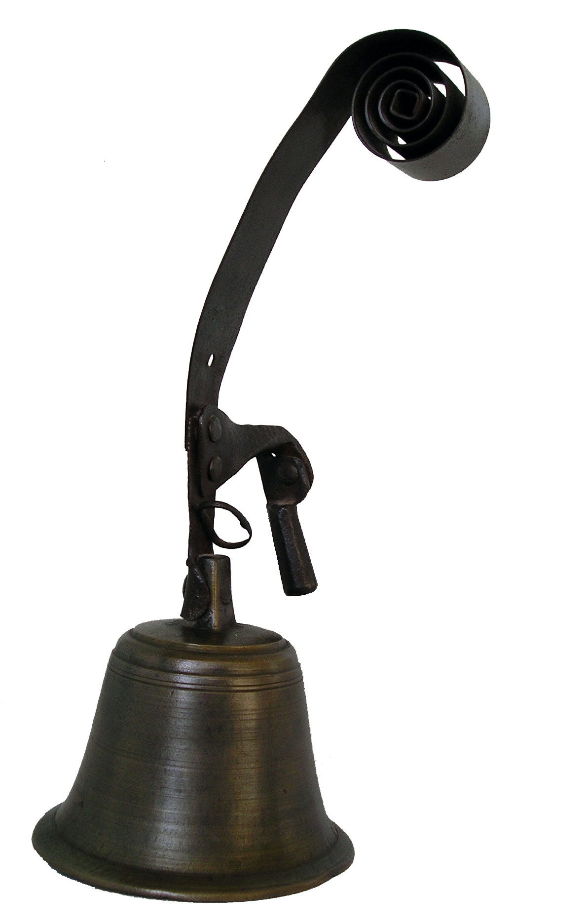
Ex: Bell doorbell makes audible sound when rung. [Wikimedia Commons]

  • Constraints. Prevents user from engaging in improper function.
File:Stop sign and road markings.JPG
Ex: A yellow line at a stop sign (usually) prevents drivers from crossing without stopping. [Wikimedia Commons]

  • Visibility. When affordances are easily discoverable.
File:Japanese Electric Water Boiler 20101026.jpg
Ex: "On" light-indicator shows the boiler is on. [Wikimedia Commons]

  • Models. When an end-user's mental representation of how something works matches with the way the system/product actually works. Varies from person-to-person.


Gestalt principles 

Are rules on how to organize content according to conventional human perception. The list includes key ideas about how our brain tends to visually simplify the complex.

  • Proximity. Objects that are close to one another tend to be mentally grouped together.
⚫⚫⚫⚫⚫

  • Similarity. Objects that are similar to one another in size, shape, and/or color are grouped together.
⚫⚫⚫⚪⚪⚪πŸ”΄πŸ”΄πŸ”΄

  • Closure. The mind completes familiar objects and patterns when elements are missing.
╭  ╮
╰  

  • Continuity. The mind continues patterns and lines, even in case of interruption.
πŸ›«✈️πŸ›¬

  • Symmetry. We parse complex scenes in a way to reduce complexity.
◢◣ ⋘⋙ 【】⦅ ⦆

  • Figure/ground. Our mind separates a scene into figure (foreground) and ground (background).
███████████████████████████
███████▀▀▀░░░░░░░▀▀▀███████
████▀░░░░░░░░░░░░░░░░░▀████
███│░░░░░░░░░░░░░░░░░░░│███
██▌│░░░░░░░░░░░░░░░░░░░│▐██
██░└┐░░░░░░░░░░░░░░░░░┌┘░██
██░░└┐░░░░░░░░░░░░░░░┌┘░░██
██░░┌┘▄▄▄▄▄░░░░░▄▄▄▄▄└┐░░██
██▌░│██████▌░░░▐██████│░▐██
███░│▐███▀▀░░▄░░▀▀███▌│░███
██▀─┘░░░░░░░▐█▌░░░░░░░└─▀██
██▄░░░▄▄▄▓░░▀█▀░░▓▄▄▄░░░▄██
████▄─┘██▌░░░░░░░▐██└─▄████
█████░░▐█─┬┬┬┬┬┬┬─█▌░░█████
████▌░░░▀┬┼┼┼┼┼┼┼┬▀░░░▐████
█████▄░░░└┴┴┴┴┴┴┴┘░░░▄█████
███████▄░░░░░░░░░░░▄███████
██████████▄▄▄▄▄▄▄██████████
███████████████████████████
Courtesy of roy from Alt-codes.

  • Common fate. Elements with the same movement (speed and/or direction) are seen as a single unit.

πŸƒπŸΏ‍♀️πŸƒπŸΌ‍♂️πŸƒ‍♀️πŸƒπŸΎ‍♂️πŸ’¨

Jakob Nielsen's Usability Heuristics 

These broad rules of interaction design help make a great and user-friendly product.

  • Visibility of system status. Keep users informed about system state.
Maya with error highlight to the right of Command Line.
Autodesk Maya has a neat message bar at the bottom showing the results of every action.
  • Match between system and the real world. Speak the user's language and speak in a natural, logical way.
"Deal enough damage and you win!" Blizzard's Hearthstone.

  • User control and freedom. Users need to be able to exit, undo, redo.
"(ESC)exit" command is persistently in view for the user.

  • Consistency and standards. Users shouldn't be confused by similar words (keep use of vocabulary consistent) and have to think whether or not they mean the same thing.
πŸ›’
Shopping 
░▓▓░░░▓▓░░▓▓▓░░▓▓▓
▓░░▓░▓░░▓░▓░░▓░░▓░ 
▓░░░░▓▓▓▓░▓▓▓░░░▓░
▓░░▓░▓░░▓░▓░▓░░░▓░

░▓▓░░▓░░▓░▓░░▓░░▓░

OR

πŸ›’
Shopping
▓▓▓░░░▓▓░░▓▓▓▓
▓░░▓░▓░░▓░▓░░░

▓▓▓░░▓▓▓▓░▓░▓▓
▓░░▓░▓░░▓░▓░░▓
▓▓▓░░▓░░▓░▓▓▓▓
?
  • Error prevention. Users should prevent errors and give users confirmation messages.
Image result for are you sure you want to delete
"Are you sure you want to move this file to the Recycle Bin?" Windows PC.

  • Recognition rather than recall. Minimize users' memory load by making objects, actions, and options visible.
All of CellPaint's commands are on the interface.

  • Flexibility and efficiency of use. Offer tutorials for beginners and accelerated options for expert users.
LyricsTraining app to learn languages through music.

  • Aesthetic and minimalist design. Extraneous info competes with relevant units of info and diminishes their relative visibility.
Neopets has really gone downhill since being sold to Viacom.

  • Help users recognize, diagnose, and recover from errors. Use plain language to offer a solution.
"Program removal failure. You must restart Windows to completely remove the program." error message well done.

  • Help and documentation. For complex software, it might be necessary to provide documentation that is easy to search, lists concrete steps, and isn't too large.
Canva has a very helpful Help button at the bottom-right of the screen.

There you have it! A very simplified overview of design concepts to get you started thinking about your next project.

Sunday, February 17, 2019

Superhero physiques

As I was watching the Justice League movies today, I couldn't help but notice that the physiques of all the heroes were pretty cookie-cutter body types. Pretty much all the male heroes share the same archetypal body shape, as do the females. (I realize this is an issue endemic in the comic book world.)


As an anatomy student who frequently thinks about biomechanics, I was reminded of this very unscientific and anecdotal Quora post. The question was How often do you see soldiers in the military with muscular physique like Schwarzenegger? Quick answer: not often.

I realized that superheroes, for whom agility and speed should take higher precedence than strength, on average should look more wiry and lean. If having superpowers didn't defy the laws of bodily physics, I wonder what superhero physiques would more plausibly look like.

Maybe superheros should more closely resemble military physiques. Photo: military recruits training for Physical Fitness Test (PFT) [Source]

The Flash, who by freak lightning-induced-chemical-spill accident, gains the power of speed and even the power to control molecular vibrations, should look more like Eluid Kipchoge, my personal idol and world-record holder of the marathon. (Unless part of The Flash's superpower precludes oxidative metabolism.)

Image result for justice league war
Justice League: War (2014).

Image result for eliud kipchoge
Photo by Marco Verch

Batman, who excels in hand-to-hand combat, stealth, agility, and superhuman reflexes, shouldn't be encumbered by all that extra muscle mass. After all, he's not as much as a heavy-hitter as much he is economical with his arsenal of moves, ranging from jiu-jitsu to his utility belt (endless supply of Batarangs, anyone?). As such, maybe he'd more believably resemble Bruce Lee.

Justice League: War (2014). He's far too bulky for the stealth and agility he possess as part of his repertoire.

Image result for bruce lee
Bruce Lee from Enter the Dragon

The Green Lantern–and as a matter of fact, all members of the Green Lantern Corps–can be anywhere, theoretically, ranging from near emaciated to the opposite. The power ring gives the power to fly through space, generate force fields, act as laser beam, etc. In other words, it sounds as though the power ring (with willpower) does all the work. If Hal Jordan weren't a civilian(?) fighter pilot and thus weren't under stringent physical exams to be able to withstand G-forces, maybe he'd manifest a much more average physique.


Human devolution as seen in Disney Pixar's WALL-E

Disuse atrophy of the leg from Wikimedia Commons

Lastly for now, Wonder Woman, if she weren't a warrior already forged out of clay by Greek gods, would undoubtedly possess the body of the explosively powerful Simone Biles. Gymnasts excel in calisthenics, acrobatics, speed, resilience, flexibility, and grace (arabesque, anyone?), all skills  that I imagine would befit an Amazonian princess.


Simone Biles takes a leap on the floor. [Source]

Well, that was fun. It's entertaining to think about the cultural influence that the comic book industry and its derivatives continue to have to today. I understand that superhero fiction is a genre that demands we suspend our disbelief to indulge in a world where relatively straightforward problems (good guy-bad guy dichotomy) are solved cleanly and predictably. If superheroes represent the type of person we want to be in this world, it can't hurt to have stylistic abstractions of superheroes that look a little more like a diversity of real people.


Saturday, February 16, 2019

Viewing your DICOM data

Do you have access to a Mac and medical imaging data that you want to view?

Knee MRI: ACL Repair by Dennis Yang

Then you should try out the open-source Horos software. Alternatively, a PC DICOM-viewing open-source software is 3D Slicer.


In my scientific visualization course in my M.F.A. Medical Illustration program here at RIT, our professor shared with us how to access free, online data sets (ex: Cancer Imaging Archive). Here is an example of a quick animation that's possible in Horos.


I'm sure there are countless applications for this technical skill. Just as an example, here's an illustration I made using one of these unique angles.

Assignment details on my Portfolium page

Wednesday, February 13, 2019

Randomness as a solution

"Across all industries, total losses due to counterfeiting in 2017 was a staggering $1.2-trillion and is expected to reach $1.82-trillion by 2020. Online counterfeiting accounted for $323-billion worth of losses last year," according to Business Tech.

Anti-counterfeiting measures are a huge and costly undertaking. A lot of money has been spent on developing and implementing product authentication and supply-chain tracing methods. Currently, markets use bar codes, RFIDs, alphanumberic serial numbers, and blockchain technology. The goal of an optical anti-counterfeiting solution is to have the end user of a product scan a unique code with their phone and check it against the manufacturer's database to confirm their product is authentic.

Bar code and RFID from Wikimedia Commons

But given the relatively slow adoption rate of blockchain as an anti-counterfeiting measure and the replicability of serial codes, there needs to be another solution. And maybe there is an ingeniously simple one.

Researchers at the University of Copenhagen reported the results of their new idea in a paper titled Versatile and Validated Optical Authentication System Based on Physical Unclonable Functions published in ACS Applied Materials & Interfaces. What did they do? They created unique QR codes by throwing sand onto it, generating random patterns.

Sand from Public Domain Pictures

Well, they didn't literally throw sand, but they did the equivalent, which was spraying microparticles (titanium dioxide with PVA) onto QR codes printed on office paper. Or in the words of the paper, they used a combination of scattering-based PUF-tags, where PUF means physical unclonable functions.

The important part is that they've validated this low-manufacturing-cost method of authentication that can generate up to 2.5 x 10^120 unique patterns (according to a 200 x 200 pixel matrix). For reference, an 11-digit UPC code can generate 10^11, or 1 trillion, unique codes. Standard RFIDs can store either 96- or 198-bits of data. Assuming the data is alphanumeric (62 possible characters) and that 8 bits make up one character, a 198-bit RFID can store up to 3 x 10^44 unique patterns. If this technology is implementing and process perfected, then maybe we can solve the counterfeiting issues that plague, most importantly, the drug market, especially in less developed countries.

Real vs. counterfeit Orlistat drug from Wikimedia Commons

Randomness is a beautiful process. Randomness sounds diametrically opposed to design, which is generally a highly deterministic and controlled system, but I wonder if there exists other design solutions that could stand to benefit from the concept of randomness.

Tuesday, February 12, 2019

What are some popular emojis?

As a person born on the cusp of the Millenial-GenZ divide, I feel a certain way when people say that emojis are the harbinger of the death of the written language. πŸ™„

But emojis simply augment our emotions in wonderful pictorial form. It expedites our conversation in an age where we probably communicate at least in triplicate scale (hello, 1,500 Facebook friends). At least for me, that communication means different strata of the same ~20 close friends, and emojis are a godsend, substituting for "lol"or (╯°□°)╯︵ ┻━┻ in quick fashion.

In my experience, here are just a few common emojis that those in my demographic particularly enjoy using. The names are from Emojipedia.

πŸ”₯

Fire. Starting with the most obvious, the LIT emoji is the poster child of the emoji-generation. As such, it's also the most commonly appropriated by adults and companies in a futile attempts to "appeal to the younger generation." Regardless, the emoji still maintains its relevance as a testament to the hotness of food, people, or temperature.

πŸ‘

Thumbs up. This is a ubiquitously universal sign of agreement and/or support thanks to Facebook. You can't go wrong with it. Although, I've begun to associate this symbol as a symbol of lackluster effort or enthusiasm because of its one-click overuse.

😍

Smiling face with heart-eyes. This is pretty self-explanatory and also another cop-out of a selection. I'm pretty sure everyone owns this in plush form, next to the poop emoji. In my experience, it's used as a sufficient reaction to cute and/or pretty things, especially animal gifs.

πŸ˜‚

Face with tears of joy. This is typically used in exuberant laughter. However, I've also witnessed it being used ironically—true to all expressions that tears can indicatelike "Me thinking about all the work I have to do tonight πŸ˜‚."

πŸ‘€

Eyes. "I see you," this emoji says. This also might be an appropriate response to someone you catch on your Facebook feed sharing something they should not. Alternatively, in the presence of attention-worthy content, this also signals, "You've caught my interest."

πŸ™Œ

Raising hands. These hands are used often in light of good news. "Praise," says these hands, "that school's cancelled because of the snow."

πŸ™„πŸ€¦‍♀️πŸ’‍♀️

Face with rolling eyes, woman facepalming, woman tipping hand. The face signals sarcasm or annoyance. The facepalm expresses further annoyance, culminating in woman tipping hand's "I guess this is my life now." These emojis represent the ever-growing cynicism among our generation.

πŸ™ƒ

Upside-down face. A perennial favorite and perpetual emotion of the graduate-school life. It represents all things negative that we have to live with, ranging from "I missed the deadline for my homework" to "my cat ran away."

πŸ‘…πŸ’¦πŸ†πŸ‘

Tongue, sweat droplets, eggplant. Classics. Just be aware that these are commonly used...innuendos. Use judiciously and knowingly.

Emojis are great. They can be as ambiguous as they can be straightforward. That openness to interpretation is a fun tension to play with, but ironically, emojis also bridge that communication gap where words are just not enough to express our true feelings. After all, actions speak louder than words, right?


Friday, February 8, 2019

On intelligence

Learning about design principles, albeit an oversimplification of them, helped me to broaden my definition of "intelligence."

Human Brain from _DJ_ on Flickr

Mental models

If someone doesn't know how something works, it's possible that they've simply retained a different mental model of how a system works. For example, if someone can't figure out how a particular faucet works, it's likely that they've been operating an entirely different kind for most of their lives. It's not a lack of intelligence as much as it is a lack of experience and poor design on behalf of the faucet designer.

Interaction Design Foundation

Emotional design

Products and systems can have a strong influence on our perspectives and thoughts. Think state-run media and today, products that strongly incorporate emotional design (like social media). Don Norman emphasizes the importance of reflective processing in design. That involves tapping into users' visceral and behavioral experiences in creating a product. Products are increasingly designed to use our behaviors and attitudes to get us to think or feel a certain way, so we can attribute a lot of personal beliefs and behaviors to our daily interactions in our environment.

Furthermore, emotional intelligence speaks to the ability to transcend manufactured preconceptions through empathy and tolerance, but not everyone has the fortune to have grown up open-minded. James Flynn incorporates a historical perspective into intelligence. He claims that the average IQ rose from 70 in the 1900s to 100 today. Nowadays people are "smarter" because they are able to form logical thoughts from abstractions, or think in the hypothetical, he also says. People of the 20th century primarily analyzed the world in terms of how much it would benefit them and established their personal values and priorities accordingly. This lends to the idea that intelligence is a highly malleable social construct.

James Flynn's TED Talk

Thursday, February 7, 2019

Cognitive science

With the advent of projects like NIH's Human Connectome Project and more advanced brain scanning models (such as for diffusion tensor imaging), we are learning more about the brain each day.

Human brain tractography by Alfred Anwander

Cognitive neuropsychology seeks to map the brain to specific functions. For example, in the mid-1800s, Broca discovered that different parts of the brain may be associated with different functions. (He observed a patient with a damaged frontal lobe that was unable to produce speech, but could understand it.)

Today, we've appropriated cognitive science and applied it to design. It's a tool that we are building to become more powerful because of the way it can subtlety affect the behavior of myriads of people globally.

For instance, Susan Weinschenk, PhD in Psychology and behavioral science expert, published an article on Smashing Magazine titled How People Make Decisions. She introduces basic concepts in the context of selling a "Pro" tier subscription service.

Source

Weinschenk says that we should always consider emotions in design. We need to first activate part of the frontal cortex to help users come to a "logical" decision. This part, the ventro-medial pre-frontal cortex (vmPFC), mitigates fear, overriding the amygdala, which is responsible for fear-conditioning.

Ventromedial prefrontal cortex from Wikimedia

She also writes that value-based decisions are made in the orbitofrontal cortex (OFC) and that habit-based decisions happen in the basal ganglia. Those decisions are made mutually exclusively, and you want to prevent the goal-directed process during sales by withholding data.

MRI of Orbitofrontal cortex from Wikimedia

Combined with "thick data," or prescriptive analytics, explaining why we do what we do, it seems as though every product in the future is going to be designed for guaranteed consumption.

I can't help but think that one day we will have mastered brain science. And that those in power will have access to the map of the human brain and use it to manipulate our volition and agency. Especially if the effects are subtle and profound.

Though only in the context of sales, Weinschenk says that offering too many choices is not conducive to making a decision. So according to cognitive psychology, it is in the best interest of product designers to offer fewer options, but isn't that idea antithetical to my right as a consumer to free choice?

Maybe I'm just conflating neurology with cognition, but because I am a person that would take the red pill over the blue any day, I think systems should be designed in a way that lends to our competency as individuals, minimizes the impacts of our emotions, and gives us equal, impartial, and transparent options.

Red pill or blue pill? Wikimedia

It's possible one day that we will have our individual brains mapped, just like more of us are having our genome sequenced.* Whether we like it or not, more stakeholders will have access to that information, even though if we collectively want it siloed. Is our brain the final frontier when it comes to our privacy?

* = Even the NHS is considering selling genetic sequencing in exchange for patient data, according to BBC News. This follows their 100,000 Genome Project, where already 85,000 patients and 15,000 tumors were sequenced, and 1 in 4 rare disease patients received a first-time diagnosis. 

Tuesday, February 5, 2019

Breaking brand (color)

Branding is touted as one of the most important aspects of business, and even individuals. Thinking of branding is a great exercise because it incorporates a necessary historical and cultural lens to the design process.

Deroy Peraza published a post on Medium titled The Women Running for President Are Breaking the Rules of Branding, and it is a wonderfully told story. He delves into history to show that few candidates historically broke brand with the traditional red, white, and blue for political campaigning in the United States. However, today, presidential hopefuls Elizabeth Warren, Kamala Harris, Kirsten Gillibrand, and Tulsi Gabbard are setting themselves apart from the pack through their campaigns' choices of color. and playing their brand colors to the narrative of a multicultural society.

The Women Running for President Are Breaking the Rules of Branding by Deroy Peraza

And on this Lunar New Year, I noticed something else that has gradually been breaking brand: the traditional hΓ³ngbāo (ηΊ’εŒ…), or red envelope. In Chinese culture, it is customary for elders to distribute red envelopes containing money to children and young adults as a sign of good luck for the coming year. Typically, its red, or vermillion, color has been an ancient symbol of good fortune and joy, hence its name. However, in recent years, designers have begun to break tradition.

Mostly of all of them used to look like this.

This is now being sold as a "vintage" red packet. Source

But now we're seeing envelopes like this.


Courtesy of my friend

As the global Chinese diaspora continues to adapt to their new cultures, it's always interesting to see how and to what extent they appropriate modern trends into their ancient traditions.

Sunday, February 3, 2019

Learning about designing for disability

Accessibility is growing topic in the topic of human-centered design, and one recently published study explores how to teach design students to incorporate disabled users, as just one segment of a diverse user population, into their design process. Moreover, students were also taught how to interact with and accommodate social needs of this particular population.

Shinohara and her research team published a paper titled, Tenets for Social Accessibility: Towards Humanizing Disabled People in Design, that investigates the attitudes of design students towards disabilities and observes how students incorporated accessible design throughout the course.


They found that developing accessible design was actually beneficial to a variety of populations, rather than solely the disabled. Furthermore, the authors found another positive externality: designing for both abled and disabled populations expanded the capacity of designers because of social needs, like social appropriateness or factors influencing the use and perception of the technology.

The authors summarize their findings by developing three tenets:

  1. Design for disability should include users both with and without disabilities.
  2. Design should address functional and social factors at the same time.
  3. Design should include tools that encourage consideration of social factors in accessible design. 

They hypothesized that by including disability as part of a diverse population of users, they could engage disability as a natural part of design. Broadening awareness and inclusion of accessibility in course curricula can lead to the development of more accessible mainstream technologies, rather than just functional disability-specific solutions. 

The authors offered two university courses (first, 42 students and 11 expert users; second, 36 students and 10 expert users) on design thinking taught a year apart to better understand how design students form a perspective on design and to test which elements in a course encourages students to incorporate accessibility into their workflow. 

They engaged students with “expert users” (those with disabilities), and the course also featured hallmarks of a design-thinking course: readings, ideation, learning and conduction of prototypes and usability heuristics, feedback sessions, and evaluations, all culminating in a term project (indoor wayfinding for blind or low-vision users). Other pieces of data included weekly journals, interview protocols and summaries, observations, brainstorms, sketches, design rationales, user testing results and heuristic evaluations, final design specifications, design process books, and expert user evaluations of student designs.

The researchers coded this qualitative data to find that working with expert users was a positive influence on student attitudes about accessibility, that it was not as hard as they thought, and that they have a role and responsibility to include accessibility into their design work. 

I like how this study also addressed social needs of the functionally impaired. For example, they found that students initially had a learning curve in designing for beyond functional issues, ignoring the principles of designing for user experience, such as designing for a visually impaired expert user who was a busy woman with a light budget or a user who didn’t want to call unnecessary attention to her hearing loss. A result of the course was also that students learned to design with considering social needs.

Tenets for Social Accessibility: Towards Humanizing Disabled People in Design

Source: Shinohara, K., Bennett, C. L., Pratt, W., & Wobbrock J.O. (2018). Tenets for Social Accessibility: Towards Humanizing Disabled People in Design. ACM Transactions on Accessible Computing (TACCESS) - Special Issue of Papers from ASSETS 2016, 11(1), 6:1-6:31. https://doi-org.ezproxy.rit.edu/10.1145/3178855.

Saturday, February 2, 2019

Social media algorithms on the urban-rural divide

Algorithms can either be a boon (to privacy advocates) or drawback (to advertisers), depending on how you look at it. But there is no denying that they play a significant role in selecting content we see on our respective social media channels.

This is demonstrated by a research paper by Issac Johnson, et al, published in the Proceedings of the 2017 CHI Conference on Human Factors in Computing Systems that uncovers that social-media algorithms fail to accurately geolocate rural Twitter users as well as urban Twitter users.

The researchers investigate the social media population biases between rural and urban communities by focusing on Twitter geolocation inference algorithms. The study found that the bias is largely the result of algorithms that disproportionately affect rural populations, rather than natural population biases.

Two types of algorithms are assessed: text-based (geotags individual tweets) and network-based (geotags individual users). They found that text-based algorithms are more subject to structural (inherent design) bias and showed less improved performance than network-based algorithms when population bias was removed.

These two types of algorithms were chosen because they had published descriptions, open-source code, and accessible data—rather than a black-box. Priedhorsky’s text-based algorithm is representative of many text-based algorithms because it is trained on tokens in the text of the tweet, user timezone, self-reported location field, and specific language. Jurgens’ bi-directional network-based algorithm was chosen because it links users that mention each other, using the principle that interaction decreases with distance.

Using the text-based algorithm, the researchers simply used a reverse geocoding operation to label each tweet with the county it’s located in and assigned the U.S. National Center for Health Statistics’ Urban-Rural Classification Scheme’s ordinal urban/rural code to the tweet. Using the network-based algorithm, researchers defined a user’s home as the geometric median of their tweets geotagged within 50 miles of each other.

https://doi-org.ezproxy.rit.edu/10.1145/3025453.3026015.

The authors hypothesized that there would be a notable population bias in the urban-rural divide, and that could potentially be influenced by algorithmic bias. Rightfully, they found that urban users were overrepresented by 130% for text-based datasets and by 210% for network-based datasets, relative to their proportion in the overall population for the datasets. Correspondingly, the text-based algorithm successfully locates urban users within 100km on average 2.3x greater than rural users, for network-based, 1.3x greater.

The current state of society is realizing the implications of this problem. Even controlled for population biases, geotagging doesn't work for everyone equally. This is just one example of the ways technology can be inequitable, if unaccounted for and implemented on a massive scale.

Source: Johnson, I., McMahon, C., SchΓΆning, J. & Hecht, B. (2017, May). The Effect of Population and "Structural" Biases on Social Media-based Algorithms: A Case Study in Geolocation Inference Across the Urban-Rural Spectrum. Paper presented in Proceedings of the 2017 CHI Conference on Human Factors in Computing Systems, Denver, CO. Retrieved from https://doi-org.ezproxy.rit.edu/10.1145/3025453.3026015