Thursday, January 31, 2019

The semantics of popular science

It seems that anyone with half of a brain cell has an opinion about climate change these days, so I guess I'll throw my two-cents into the ring.

In light of current naysayers of climate change and Washington state's measles outbreak, it's hard not to think about where we went wrong with the messaging of popular science. (After all, there's little else to do here in -20-degree polar-vertex-induced weather.)

These issues are multi-faceted and oftentimes oversimplified, stemming from misinformation and sometimes taken up in arms with religious zeal. Putting reasons of anti-establishmentarianism, willful ignorance, and corporate denial campaigning, aside, I've begun to think about the current branding of popular science and why it has become divisive.

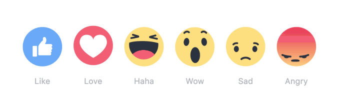
Social media incentivizes engagement with what's popular, not ethical.


The topics of climate change and vaccination are similar today because they evoke a lot of emotion, and emotion is where the money is. It doesn't matter that some of that emotion is frustration or fervent denial. So long as these trendy topics raise alarms and attract eyeballs and clicks, there is no incentive for advertisers to care whether or not the ethical outcome is productive.

Online media companies capitalize on user engagement, algorithmically striving for a balance of happy and validating content sprinkled with the occasional controversial newsbit. There doesn't seem to be much commercial demand outside of emotion. (In fact, some nonprofits and advocacy groups even sustain themselves heavily on the emotions and influx of dollars that correspond with the political news cycle.) Social media isn't designed to afford the bargaining of deeply entrenched beliefs, as much it's monetized the riling of those beliefs.

The extended Kubler-Ross grief cycle

Sometimes I think that the social media echo chambers perpetuate emotionality, if not manufactures it by design. In other words, I feel like the cultural warfare between "us" and "them/deniers" is perceived to be more magnified than it actually is because we each live within our own bubbles of confirmation bias. This de-personalization does injustice for both sides of the aisle.

Furthermore, alarmism does little to correct our mental models of the quantitative data regarding specific issues. I am an optimist because the number of reported measles cases has dropped significantly from 1954 to today, at least 800-fold. I am slightly alarmed at the smaller number of unnecessary deaths in the past ten years, but acknowledge that there is little I can do in my current position to persuade the likes of ultra-Orthodox Jewish communities to vaccinate their children. What value do I get from receiving headlines repetitively about the measles outbreak in Washington, Disneyland, and Oregon in my newsfeed beyond a feeling of moral superiority and soft keyboard advocacy with a "like"?

The History of Vaccines data from 1954-2008
CDC data from 2010-2018

(Of course, I'm only complaining of the magnitude, not of the fact that media blazes alight from news that the Trump Administration plans to lift offshore oil drilling moratoriums. When that inspires a collective and productive rise in arms among a more informed public, I think that's a net good.)

Resilience Library

Ironically, another consequence of when climate change is used to sensationalize is that the usage begins to undermine its own weight and desensitizes users to its urgency. Readers begin to admonish the movement, associating it with tree-huggers or rock-lickers. It's just natural heuristics. Newton's Third Law states that for every action, there is an equal and opposite reaction, and brandishing climate change as a virtue signal undoubtedly attracts its share of contrarians. Climate change as a cohesive brand is useful as an awareness tool, but terrible at helping people comprehend the disparate foundational knowledge and facts that make up climate change.

Popular science is still relatively nascent.


After all, popular science can be rather exclusionary based on education level, and that needs to be strongly considered in the messaging of popular science. If you consider a generation-by-generation time frame, popular science is nascent. Modern philosopher James Flynn claims that newer generations are increasingly able to form logical thoughts from abstractions because that's the demand that our interconnected, global society requests of us. It's easy to envision hypothetical scenarios of an apocalyptic wasteland in one scenario of Pascal's wager, which is a sufficiently convincing argument to act. 

Pascal's wager, climate change edition. Source

But despite countless systematic reviews show that vaccines are not linked to autism (a stigma of which also needs to be addressed), there are still those who insist otherwise because a reliable friend, family, or neighbor told them so. One example is a holy grail of research, involving multiple cohort studies, case-control studies, and randomized clinical trails, that disproved any connection between the MMR vaccine with autism, asthma, leukemia, hay fever, type I diabetes, and much more.

If we don't engage thoughtfully in emotional design, then we're not very helpful to other people. Sometimes it's not that people don't believe in corrective information regarding vaccination, but there's no profound emotional impetus to translate that belief into behavioral change.

There must be a paradigm shift in how we evaluate our messaging--maybe that's thinking in terms of emotional, or specifically trust, capital? There's no silver bullet to get people to act on climate change or vaccine their children, but I imagine that individualized regional policy considerations might be a part of the solution, like the NYC HOME-STAT program's lean towards more trustful analog communication channels.

I believe that somehow we can design the messaging around popular science to make it more inclusive. How can we alter the semantics, rather than content, specific to each strata of people, coupled with proper channels of outreach? What are other compelling calls to action, if not social responsibility? What are pain points we can eliminate to make socially responsible action more accessible?

Tuesday, January 29, 2019

The social media soapbox

Social media can seem like a free-for-all, open platform in which everyone has an equal say.

However, it's that exact premise that raises questions regarding the quality of the content we're exposed to online. If you give everyone a soapbox, what's the outcome? Furthermore, how is the outcome affected by the way social media is designed? How do we fix it?

Alex Jones' Infowars
Buzzfeed News

Contemporary philosopher Regina Rini explores these consequences during her interview with political philosopher Robert Talisse on the podcast Why We Argue on the topic "Is social media killing democracy?"

Largely, I believe Rini argues that social media is a product where public discussion is transmogrified into performance art. (Gone are the days of civil discussions about hard topics with friends over lunch or at the bar.) Social media platforms are engineered to encourage grandstanding because it is the most controversial statements drive the most user engagement, which feeds Facebook's bottom line and the top of our newsfeeds.


The concept of user engagement itself is fraughtful. It is easy to consider a single "like" as proxy for affirmative testimony, but my mom "liking" my post about burnt-out millenials isn't generally an agreement with that article. In other words, my act of sharing a post isn't as simple as an endorsement for the particular publication, author, and all of the views they espouse, but our natural impression might be otherwise. (Maybe this is also why social media helped us to self-sort into specific ideological camps.)


Social media is different from bar conversation because the information posted is filtered and distorted. We all know the keyboard activists in our feeds–those emboldened by the low-risk endeavor that is to "reshare" a controversial post–myself included. This is a problem because there is less opportunity for the nuances of natural conversation to take shape online. As social creatures, we've had a long history of attaining knowledge from others. (In fact, Yuval Harari attributes our social nature to the success of our survival as a species.) But when we treat low-caliber endorsements from social media like normal testimony from our closest friends and family, information becomes understandably distorted.

Source

Lastly, Rini and Talisse discuss the asymmetry of online debate. Social media is not designed as a platform for debate. An open floor does not guarantee everyone as equal participants in moral debate. Especially when few people are trained in public debate. And especially when one side extemporaneously flourishes newly acquired technical vocabulary like a child brandishing a sword twice his length. Plus, winning an argument hardly proves productive, let alone changes a person's mind.

I think one immediate cultural approach to fix social media is radical transparency. We shouldn't allow companies to advertise their platforms using lofty statements akin to Twitter's "To give everyone the power to create and share ideas and information instantly." Instead, social media companies should be labeled, one way or another, as marketing companies.

Source

Also, I think we need to design a human-centered system that goes beyond verified identities and independent watchdogs to confirm the veracity of online content. I imagine that part of that system is education, social media awareness campaigns, artificial intelligence, and government regulations. Will all of that prepare us for when deepfakes become a regular installment in everyday life?

Obama deepfake

Maybe we can start by taking greater personal responsibility for our statements online, design different interfaces for different audiences, or iterate an open-source social media platform. Overall, Regina Rini and Robert Talisse lead an excellent discussion about the problems of the current state of social media as an open forum, and I highly recommend giving them a listen.

Monday, January 28, 2019

Hook, line, and sinker

Jeff nails it with this video.


Good comedy is made when someone takes a joke and runs with it through the hills and beyond. Jeff introduces to us the "SF Diet," or the Stomach Flu Diet, that "allows you to eat virtually anything you want without worrying that it is going to go to your waistline and make you fat...because you will not likely be able to keep down any of the food that you ingest."

His hook, "40% FASTER THAN KETO," is eye-catching. But only because it's Jeff Cavaliere, MSPT, CSCS, and highly respected all-star personal trainer. Not only is this out of character, the Pratfall effect means that we respond to a competent figure of authority's obvious clickbait or potential blunder favorably.


Then he proceeds with six-minutes of semi-professionally produced satire without missing a beat. What impresses me is that he manages to seamlessly use real before-and-after images from the actual program that he's selling throughout the video.


ATHLEAN-X™ is an intriguing case study in personal branding because of the unique way Jeff packages his content. He provides free, quality, though disparate, physical training content through his YouTube channel. From a business development perspective, this subscription-based video marketing is highly effective because each instance is a crucial prospective customer touchpoint. That's the equivalent of someone shopping through your store X number of times, which each subsequent visit increasing the likelihood to purchase a product.


Then, his regimented training program and products are merely an upsell from the free training he provides on YouTube. With an audience of 6.8M subscribers and average video publication rate of 9 videos per month, we can assume that he averages 1M pairs of eyes per video, or 9M pairs of eyes per month. If we presume ATHLEAN-X™ has an average product price of $97, it only takes about 860 program sales, or 0.0095%, of those monthly pairs of eyes for him to net an annual salary of $1M.

Psychology dictates that people will go for the "LIFETIME ACCESS" $97.00 product because it is "only" $20 more expensive than the "120 DAY ACCESS" product.

It is wise strategically that Jeff runs his own fitness enterprise because it gives customers the option of a one-stop shop. He integrates the sale of complementary fitness products and supplements with his program. He can pull this off because not only is he a legitimate fitness authority, but through YouTube videos like the SF Diet, Jeff humanizes himself. The bottom line is, Cavaliere sells because he is a walking, flawed (see Pratfall effect), living, breathing, testimony of his own product, to which the fitness industry, fortunately, can lend itself.

Hook, line, and sinker, well done, ATHLEAN-X™.


Sunday, January 27, 2019

Accessibility


Extra Credits, a fantastic YouTube channel, created an informative video about the importance of considering accessibility early in the design process. They illustrate plenty of examples where design features originally intended for the sensory impaired actually benefits the non-handicapped in various scenarios.


I think the positive externalities of designing with accessibility in mind is a great value proposition for companies and individuals. Even though accessibility is now dogma for anyone who studies human-computer interaction, there exists plenty of interfaces that lack accessible functionality, particularly in cinematic settings.

Man of Steel, 2013

In most situations, I believe that creating broadcast-quality and beautiful content should not supersede the effort to create content for multiple modalities.* After all, 1.3B people globally live with some sort of vision impairment [WHO], 1 in 8 Americans over the age of 12 have detectable hearing loss in both ears [NIH], and that's not even counting processing or motor disorders.

The Web Content Accessibility Guidelines (WCAG) 2.1 demands the following technical descriptors of web products: operable, understandable, and robust. They include ideas ranging from maximizing legibility with sufficient contrast to ensuring the programmatic discoverability of elements to assistive technologies.

https://www.w3.org/WAI/WCAG21/quickref/

I believe that when the day comes that a majority of web products comply with most, if not all, of the  WCAG, assistive technologies can be more easily standardized and improved. Going forward, I think it's wise to set a standard of personal responsibility for my design projects.

I'm always open to learning more about designing for disabilities, and if there are any resources or stories that would be helpful, please do share with me.

Recommended reading: Shinohara, K., Bennett, C. L., Pratt, W., & Wobbrock J.O. (2018). Tenets for Social Accessibility: Towards Humanizing Disabled People in Design. ACM Transactions on Accessible Computing (TACCESS) - Special Issue of Papers from ASSETS 2016, 11(1), 6:1-6:31. https://doi-org.ezproxy.rit.edu/10.1145/3178855

Saturday, January 26, 2019

Blogger Brutalism

I've actually considered designing my own website from scratch, but decided to eschew the upkeep in favor of a simple Blogger interface. For the purposes of a personal website, I wanted a space to share and archive ideas while maximizing usability.

Rather having to deal with writing my own script or pay for web hosting, Blogger has everything I need: an editor to draft and publish time-stamped blog posts, web-standard compliant templates, the ability to direct my custom domain to Blogger's Google servers, the option to edit source code, and additional integrations like AdSense.

Even though Pantophagy Design is the name of my website, it is not explicitly a portfolio website. I believe that better platforms exist for the exhibition of my design projects, such as my Portfolium page. Over time, I learned that, at least in my current stage of life, I am a larger fan of strategy and process than product, which is how I ended up here. I look up to James Gurney, who is a brilliant painter and multimedia artist himself, but has made a bigger name for himself for his teaching and experimental attitude.

http://gurneyjourney.blogspot.com/

I also hesitated using Blogger at first because, in this day and age, it's easy to feel that modern-day visual design skews towards minimalism. Case in point, take a look at Uber's third redesign at Uber's 2018 rebrand webpage. In summary, Uber prioritized functionality by creating a typographic logo that is highly legible and recognizable. 

https://www.uber.design/case-studies/rebrand-2018

Whenever I think of this design movement, I feel compelled to create sterile, utilitarian, and perfect interfaces, and I have to pull myself back by remembering today's brutalism, which is an art movement that is a cultural reaction to the lightness of modern visual design. This is perfectly demonstrated by Yale School of Art's website.

http://art.yale.edu/

You might be thinking–how pretentious is it that they're ironically using old-school HTML-based web design? But their choice in web design is still legitimizing. I used to think that brutalism was diametrically opposed to good visual design, but I realized that's like comparing apples to oranges, since brutalism describes an aesthetic style, rather than a visual strategy. In fact, they're not mutually exclusive since a lot of brutalist websites seem to use highly legible text.

Another perspective: Brutalist architecture was ugly at 100% function over form, whereas brutalism in web design today kicks it up to 200%, as a rebellious, ugly fashion trend.

After all, how refreshing is it to encounter a web page that looks like how you fundamentally understand a website works –a website that doesn't reflect the potentially insidious intentions of the company trying to use psychological trickery to get you to look at or click on a certain thing, or –a website that simply has every link and special effect thrown onto the front page because that was the extent of their creators' technical abilities?

http://www.cnn.com/US/OJ/

http://www.dpgraph.com/


Other brutalist websites: https://brutalistwebsites.com/.

Thursday, January 24, 2019

KISS

Keep it simple, stupid, or KISS, can be a vastly underestimated concept for those not yet familiar with basic design principles.

Maybe you've encountered a professor with information-dense slide decks, or maybe you know someone who sprinkles extraneous adverbs or unnecessarily complex vocabulary words when they speak. Or there's that tactical (not really) approach of disguising a fundamental lack of understanding with details upon details. So what does KISS look like?

I think one of the most important considerations to make when designing a product in compliance with KISS is cognitive load, which is better informally known as working memory. Products designed with complexity for complexity's sake only acts as a distraction, robbing valuable mental capacity that is a learner's limited working memory.

Granted, there are those who possess a larger working memory compared to others, but that's why we must consider our audience. My high school chemistry teacher once said, "There are two teaching styles: one, to only address a limited set of general topics to accommodate a majority of learners, or two, to pursue a quick and comprehensive pace that maximizes the learning potential of the most capable."

I feel that the topic is a perennial debate, but today, we have the privilege of video, which is a more audience-agnostic educational format. I want to share an example that I think demonstrates KISS well: the YouTube channel Chubbyemu.


The narrator is an actual MD that presents real-life case studies. His video titles, presentation style, and storytelling are clear, concise, and straightforward. There are no special video or audio effects, and the frilliest props he uses are the multi-colored desk lamps he uses as a backdrop. Furthermore, he maximizes information accessibility by aligning his many, many (endearingly home-brewed) B-rolls with his lecture content. In other words, this means your ears and your eyes work together to absorb the same learning material.

Chubbyemu is a fantastic learning resource for learning pathophysiology, and I'm sure that any visual communications specialist can extol the amateur filmmaker-narrator Bernard for his lucid approach.

Wednesday, January 16, 2019

Welcome to Pantophagy Design


Hello everyone,

My name is Victoria Maung, author and artist here at Pantophagy Design.

Why pantophagy? The prefix panto- means "all, the whole," and -phagy means "to eat." Together, pantophagy refers to the consumption of everything.

That's how I describe my life. Admittedly, I'm that person who delays the end of class because I always have something to ask–the one everyone gets annoyed at.

But I'd like to think that I might have something to show for this vexing habit.

This blog will be a space where I explore concepts in design, interesting articles on cognitive psychology, people I admire, and abstract thoughts about the state of our world.

Thank you for being here, and I look forward to hearing from you.

Sincerely,
Victoria